
Before Redesign aka Zynga's YoVille
When Big Viking Games reacquired YoVille from Zynga (They had previously sold it to them and it formed the foundation for all of Zynga's Ville games, Farmville, etc.) I was tasked with redesigning the newly branded YoWorld.
After Redesign aka YoWorld
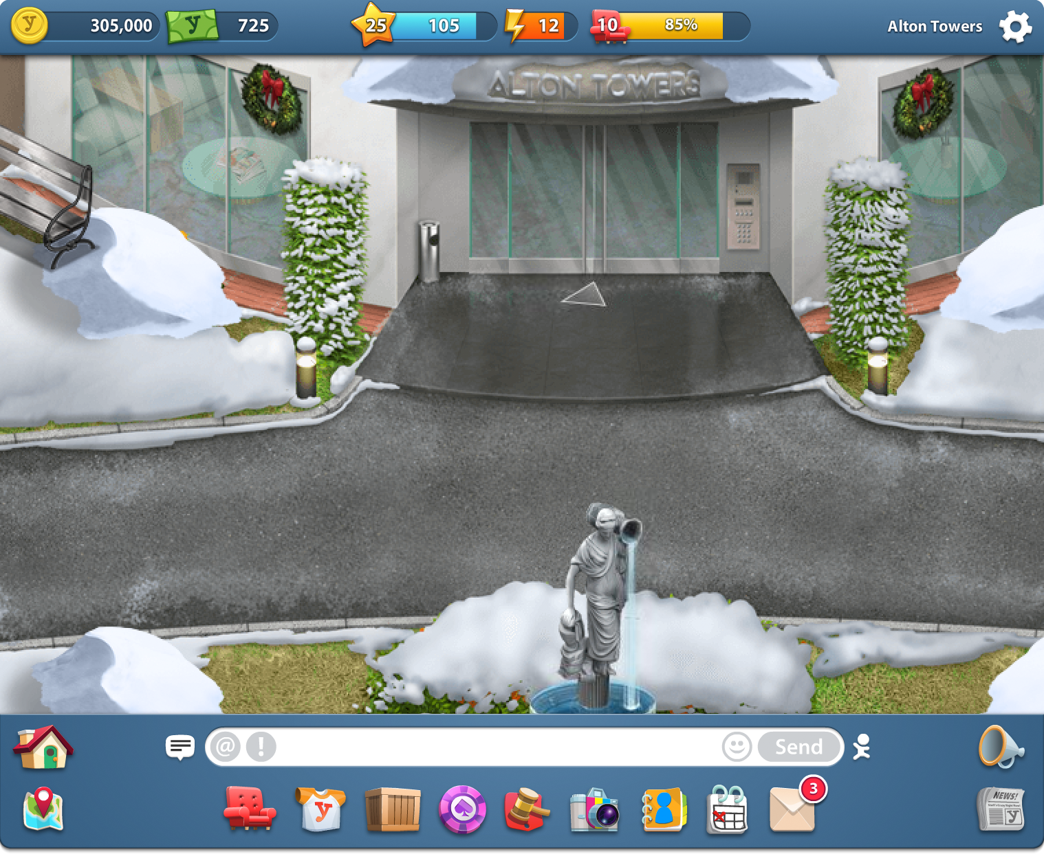
When we launched the redesign, the primary UI color was a fairly saturated blue. Most of the player feedback was about what a terrible colour choice that was. The next day I updated it to the slate blue you see above and feedback was instantly positive.
The Case for the UI Bar
One of the main features of the game is elaborately decorating the rooms in your home and players often complained that too much of the interface was overlapping the decorating space. While most modern games have the player's wallet and other UI elements floating above the game space to maximize immersion, with the limited size of the rooms, our audience found any overlapping to be too intrusive. I pushed all of the interface elements out of the game space and neatly arranged them within the top and bottom UI bars.
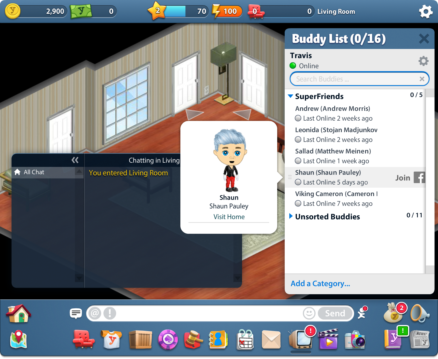
In this recent image of the live game you can see how scope creep has affected the number of icons and notifications badges cluttering up the interface.

A daily retention prize calendar. We reskinned this each month to fit the season.
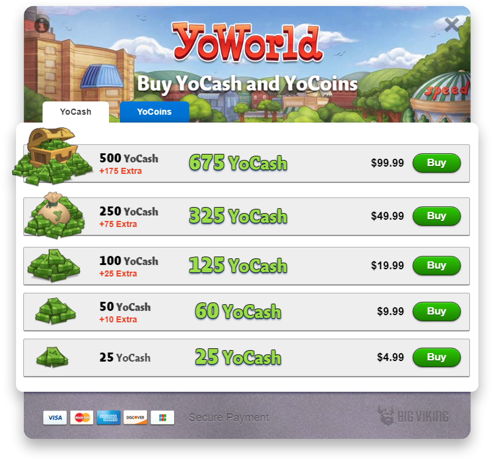
The currency purchase screen. Like many of the supplemental screens, I built this one in HTML and CSS.